CLIENTE: FOCOMED
PT
Produção da logo e manual de marca para a empresa Focomed - Distribuidora de medicamentos. A empresa entrou em contato necessitando de uma nova marca, mais moderna e atualizada com o mercado
EN
Production of the logo and manual's brand for the company Focomed - Distribuidora de Medicamentos. The company got in touch needing a new brand, more modern and updated according to the market.

PT
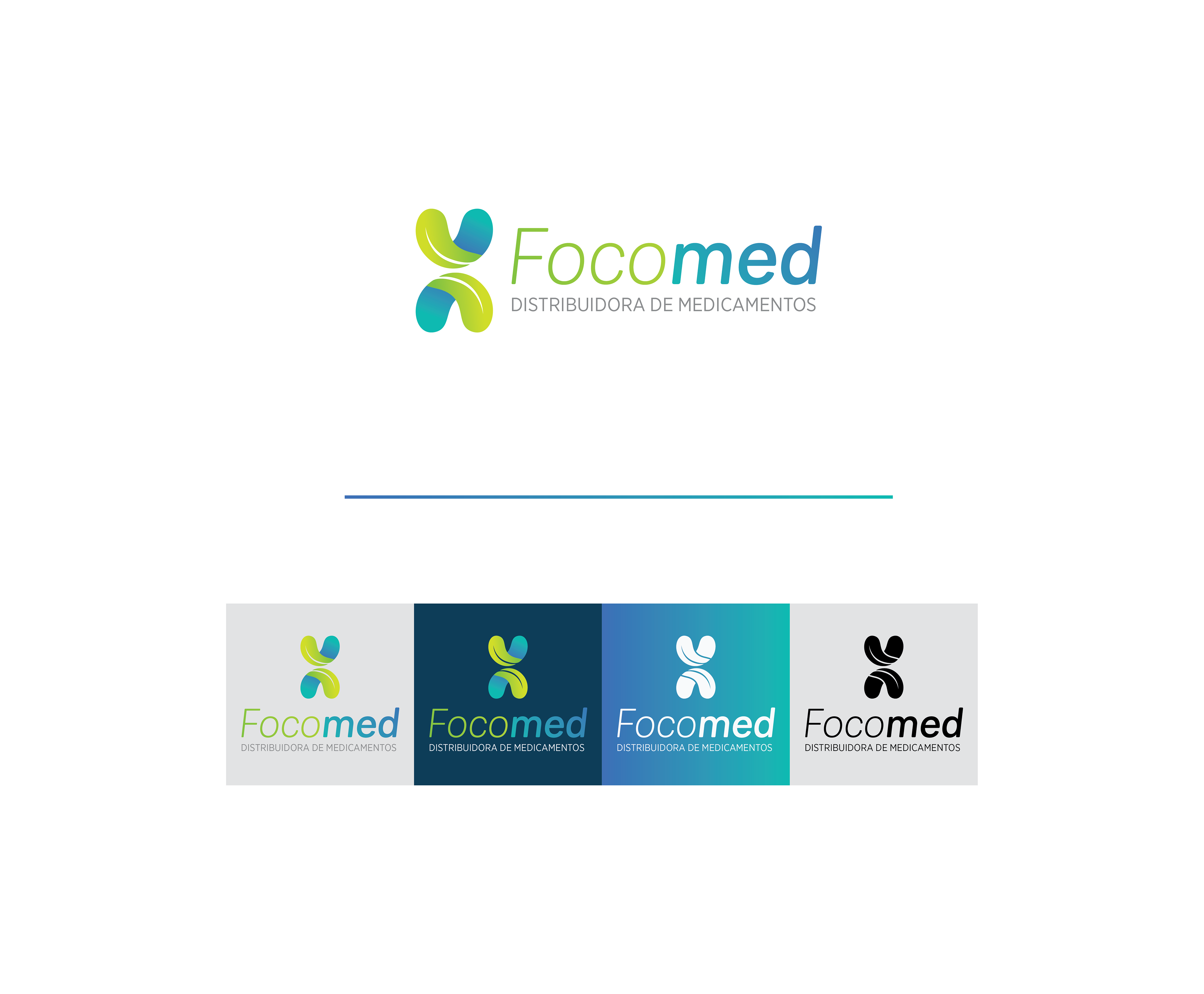
CONCEITO
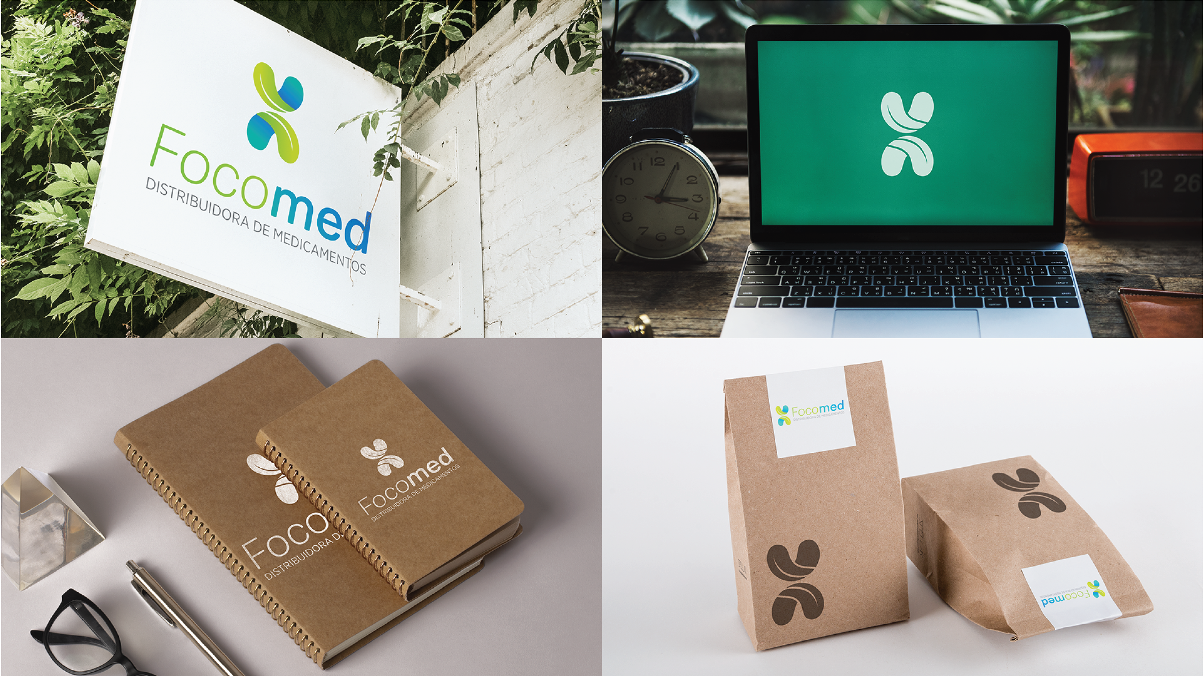
O símbolo do logo Focomed foi desenvolvido ao misturar 3 signos: folha, água e a estrutura do DNA. O símbolo possui uma metade que faz referência a folha e outra a água, a gota e a folha se encontram no topo até a circunferência dando ideia de leveza e movimento. Por último, eles são espelhados trazendo uma metáfora com a forma do DNA, o código da vida.
EN
CONCEPT
The Focomed logo symbol was developed by mixing 3 signs: leaf, water and the DNA structure. The symbol has a half that refers to the leaf and the other half, to water. The drop and the leaf meet at the top up to the circumference giving an idea of lightness and movement. Finally, they are mirrored with a metaphor in the shape of DNA, the code of life.
The Focomed logo symbol was developed by mixing 3 signs: leaf, water and the DNA structure. The symbol has a half that refers to the leaf and the other half, to water. The drop and the leaf meet at the top up to the circumference giving an idea of lightness and movement. Finally, they are mirrored with a metaphor in the shape of DNA, the code of life.

PT
CORES
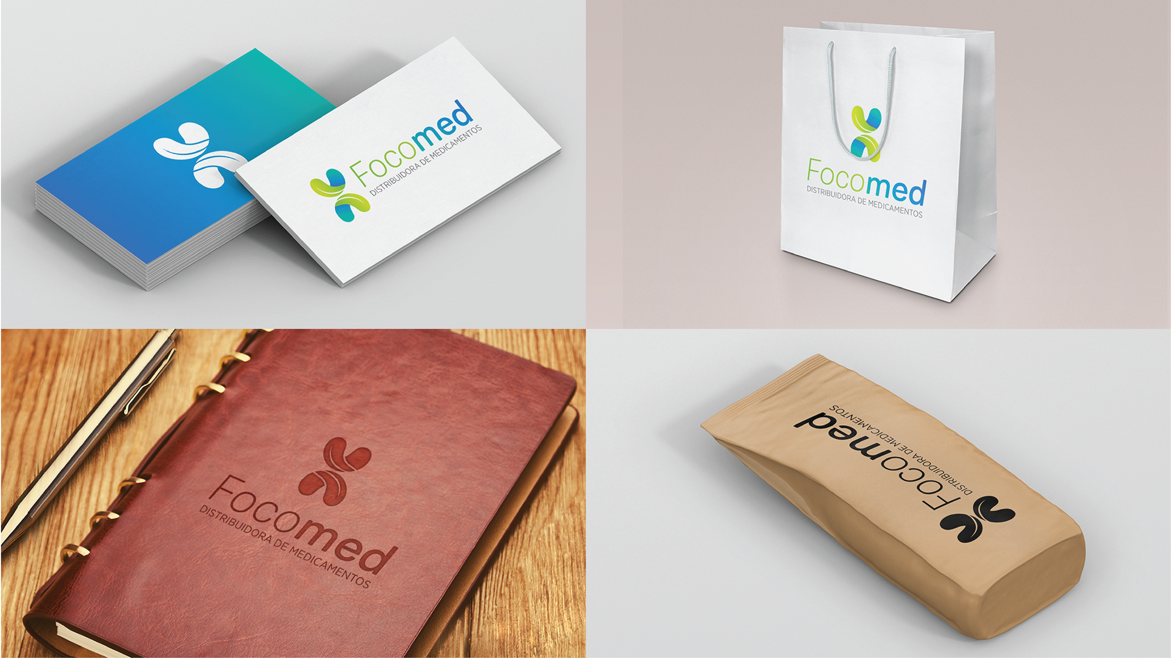
As cores escolhidas fortalecem a ideia de seriedade e saúde. A paleta sugerida trabalha com um leve gradiente presente em elementos futurísticos, fortalecendo a modernidade da marca e o novo.
EN
COLORS
The chosen colors strengthen the idea of seriousness and health. The suggested palette works with a light gradient found in futuristic elements, strengthening the modernity of the brand and the new.
The chosen colors strengthen the idea of seriousness and health. The suggested palette works with a light gradient found in futuristic elements, strengthening the modernity of the brand and the new.